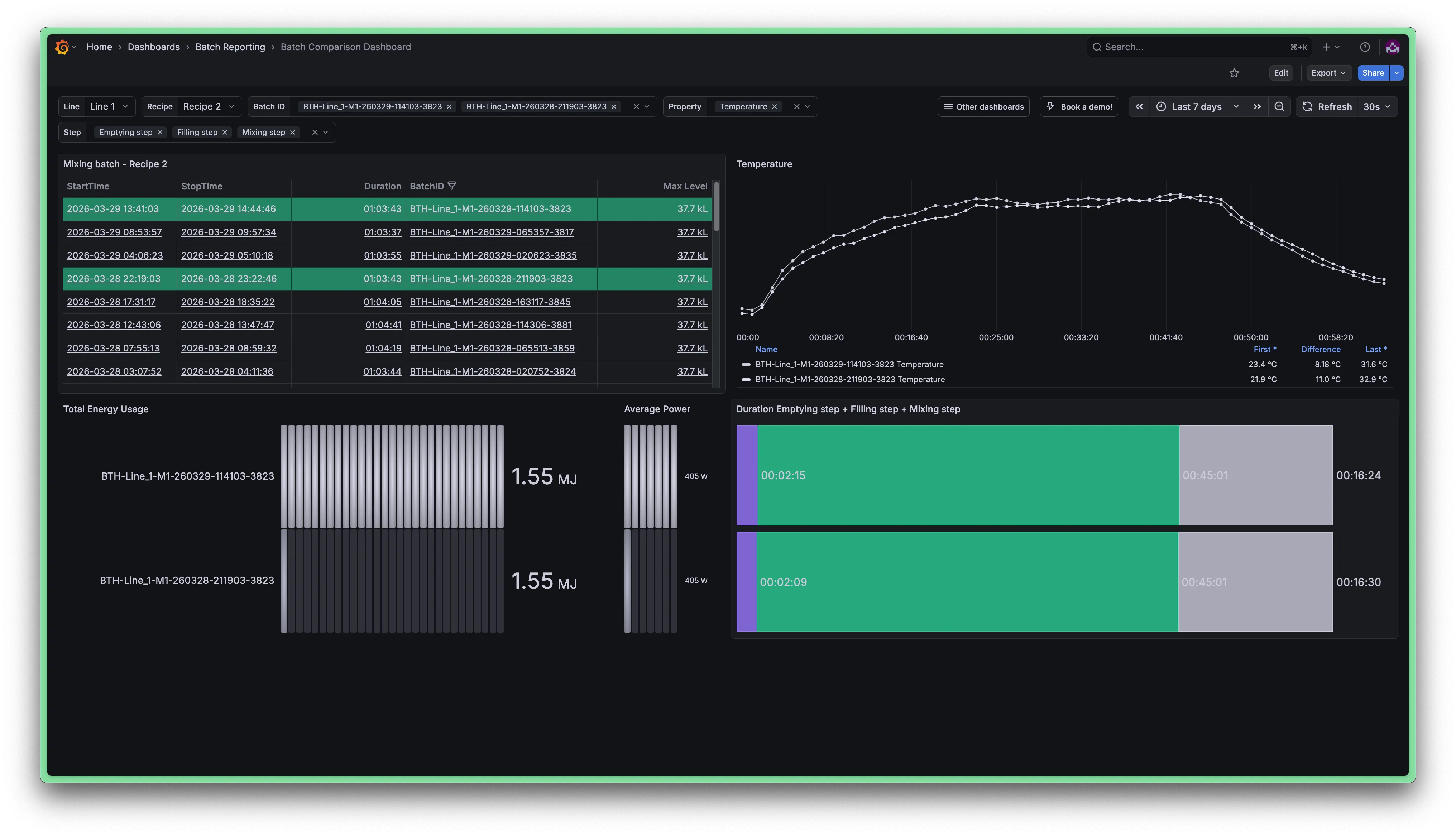
Batch comparison dashboard
Introduction
This document describes how to set up a more advanced batch comparison dashboard. It allows operators and process engineers to select multiple batches and compare their process signals, energy usage, and step durations side by side.
Audience: Process engineers, shift leads
Purpose: Batch-level analysis and performance comparison
Dashboard layout
- Batch selection table
- Process signal trend (per batch)
- Energy & power comparison
- Step duration breakdown
Step-by-step
This dashboard relies on a cascade of variables: the selected line drives the mixer, which then determines which recipes and batches are available. Two additional variables control which property and which batch steps are visualised in the lower panels.
Create variables $line and $mixer
Follow the same steps as described in the Operator dashboard guide to create the $line and $mixer variables. The configuration is identical.
Create variable $recipe
This variable populates from the distinct Recipe property values found in Mixing Batch events, so the user can filter the batch list by recipe.
- General
- Name: recipe
- Label: Recipe
- Query options
- Query Type: Event property values
- Asset: $mixer
- Event type: Mixing Batch
- Property: Recipe
- Selection options
- deselect 'Allow custom values'
Create variable $batchID
This is a multi-value variable that lets the user pick one or more batches to compare. It is filtered by the currently selected $recipe.
- General
- Name: batchID
- Label: Batch ID
- Query options
- Query Type: Event property values
- Asset: $mixer
- Event type: Mixing Batch
- Property: BatchID
- Property filter: Recipe = $recipe
- Override time range: Checked (This ensures all historical batch IDs are returned, not just those within the dashboard time range.)
- Selection options
- Multi-value: Checked
- deselect 'Allow custom values'
- Sort: Alphabetical (desc) (most recent batch IDs surface first)
Create variable $property
This variable lets the user choose which numeric asset property to plot in the trend panel.
- General
- Name: property
- Label: Property
- Query options
- Query Type: Asset property
- Asset: $mixer
- Datatypes: number
- Selection options
- Multi-value: Checked
- deselect 'Allow custom values'
Create variable $step
This variable controls which batch sub-steps are included in the step duration chart.
- General
- Name: step
- Label: Step
- Query options
- Query Type: Event type
- Filter by keyword: /step$/ (Matches Filling step, Mixing step and Emptying step.)
- Selection options
- Multi-value: Checked
- deselect 'Allow custom values'
This panel is the central navigation element of the dashboard. It lists all Mixing Batch events for the selected recipe and time range, and highlights the currently selected batches so the user always knows which ones are being compared in the other panels.
Click  > Visualisation and select Data source: Factry Historian Datasource
Configure query IN: selected batches
- Tab: Events
- Query type: Simple
- Assets: $mixer
- Event types: Mixing Batch
- Property filter:
- Recipe = $recipe
- BatchID IN $batchID
Add a second query NOT IN: unselected batches
Duplicate the first query and change the BatchID filter to NOT IN $batchID. This separation is what enables row highlighting: the IN query results get a background color via a calculateField (index) transformation, while NOT IN rows remain unstyled.
Add transformations
- Calculate field Mode: Row index, applied only to the IN query (filter by ref ID). This creates a Row column whose presence marks selected batches.
- Merge series/tables Combines the IN and NOT IN results into one table.
- Filter fields by name Keep: BatchID, StartTime, StopTime, Duration
- Sort by Field: StartTime Reverse: Checked
Change visualisation to Table and configure panel options
- Panel options
- Title: Mixing batch - $Recipe
- Field overrides
- BatchID: enable column filtering (Filterable: Checked), set a fixed column width
- Row: Cell type → Color background (basic), Apply to entire row: Checked, map >= 0 to a highlight color (e.g. #25cd9399), hide the column from the visualisation (Hide from viz: Checked)
- Data links on BatchID:
- Add to graph → links to the same dashboard passing ${{__all_variables}}&var-batchID=${__data.fields.BatchID}
- This will refresh the dashboard with the current variables selected but the new BatchID added as well.
See Grafana Dashboard URL Variables for details.
This panel overlays the selected process property (e.g. Temperature, RPM) for each selected batch on a common time axis so the shapes can be compared directly, independent of when each batch ran.
Click > Visualisation and select Data source: Factry Historian Datasource
Query options:
- Time range override: now-1y to now (prevents the dashboard time picker from clipping the data if the selected event is not in the time window.)
- Hide time override: Checked
Configure the data source
- Tab: Events
- Query type: Periodic
- Assets: $mixer
- Event types: Mixing Batch
- Asset properties: $property
- Aggregation: mean, period: 1m
- Property filter: BatchID IN $batchID
- Override assets: $mixer
- Fetch asset properties: Checked
Enabling Fetch asset properties tells the query to also return an asset's properties alongside the properties stored on the event. This is what makes the $property variable actually work as a selector here. So select $property from $mixer here.
Add transformation
Filter fields by name
- Identifier: ^(?!Level ).* This excludes the event property Level which is stored on the event. If we don't do this the Level property will always be show, regardless of the setting of $property, which is undesired here.
Change visualisation to Trend
The Trend panel type is required here because the data is periodic (index-based) rather than time series.
Configure panel options
- Panel options
- Title: $property
- Transparent background: Checked
- Default display name: ${__field.labels["BatchID"]} ${__field.labels["Property"]}
- Legend
- Mode: Table
- Values: First (not null), Diff, Last (not null)
Two side-by-side bar gauges give a quick energy summary across the selected batches.
Add the Total Energy Usage bar gauge
Click > Visualisation and select Data source: Factry Historian Datasource
- Tab: Events
- Query type: Simple
- Assets: $mixer
- Event types: Mixing Batch
- Property filter: BatchID IN $batchID
Add transformation Grouping to matrix:
- Column field: BatchID
- Row field: Asset
- Value field: Total energy usage
Change visualisation to Bar gauge and configure:
- Orientation: Horizontal
- Display mode: LCD
- Name placement: Left
- Reduce: Last (not null)
- Title: Total Energy Usage
- Transparent background: Checked
Add the Average Power bar gauge
Duplicate the Total Energy Usage panel. Change only:
- Grouping to matrix value field: Average power
- Title: Average Power
- Name placement: Hidden (the batch IDs are already shown in the adjacent Total Energy panel)
- Width: narrow
This panel shows how long each batch step (Filling, Mixing, Emptying) took for each selected batch, stacked horizontally.
Click > Visualisation and select Data source: Factry Historian Datasource
Configure the data source
- Tab: Events
- Query type: Simple
- Assets: $mixer
- Event types: $step
- Include parent info: Checked
- Property filter (parent): parent:BatchID IN $batchID
Using Include parent info and filtering on the parent's BatchID property links each step event back to its parent Mixing Batch, so the chart can be grouped correctly.
Add transformations
- Merge series/tables
- Grouping to matrix:
- Column field: EventType
- Row field: Parent_BatchID
- Value field: Duration
- Organize fields Reorder columns so the steps appear in the logical process order: Filling step, Mixing step, Emptying step.
Change visualisation to Bar chart and configure panel options
- Panel options
- Title: Duration $step
- Bar chart options
- Orientation: Horizontal
- Stacking: Normal
- Bar width: 0.97
- Show value: Auto
- Legend
- Visibility: Unchecked (the step names are already visible as bar segments)
- Field overrides Assign consistent colors:
- Filling step → #9977ff
- Mixing step → #25cd93
- Emptying step → text (default)
End result
The finished dashboard provides a complete batch comparison workflow:
- Select a recipe with $recipe to filter the batch list.
- Pick one or more batches in the table (highlighted rows = selected) or via the $batchID variable.
- Switch properties with $property to compare Temperature, RPM, Energy usage, etc. in the trend panel.
- Toggle steps with $step to focus the duration chart on specific phases.
The dashboard refreshes every 30 seconds, so it remains useful during an active batch as well as for post-batch analysis.